Thursday, November 17, 2016

ARCH101 BASIC DESIGN / Exercise 8 (1st JURY)


1st CRITIC


2nd CRITIC


3rd CRITIC

(Sorry for not having been able to take better photos in critics!)


JURY


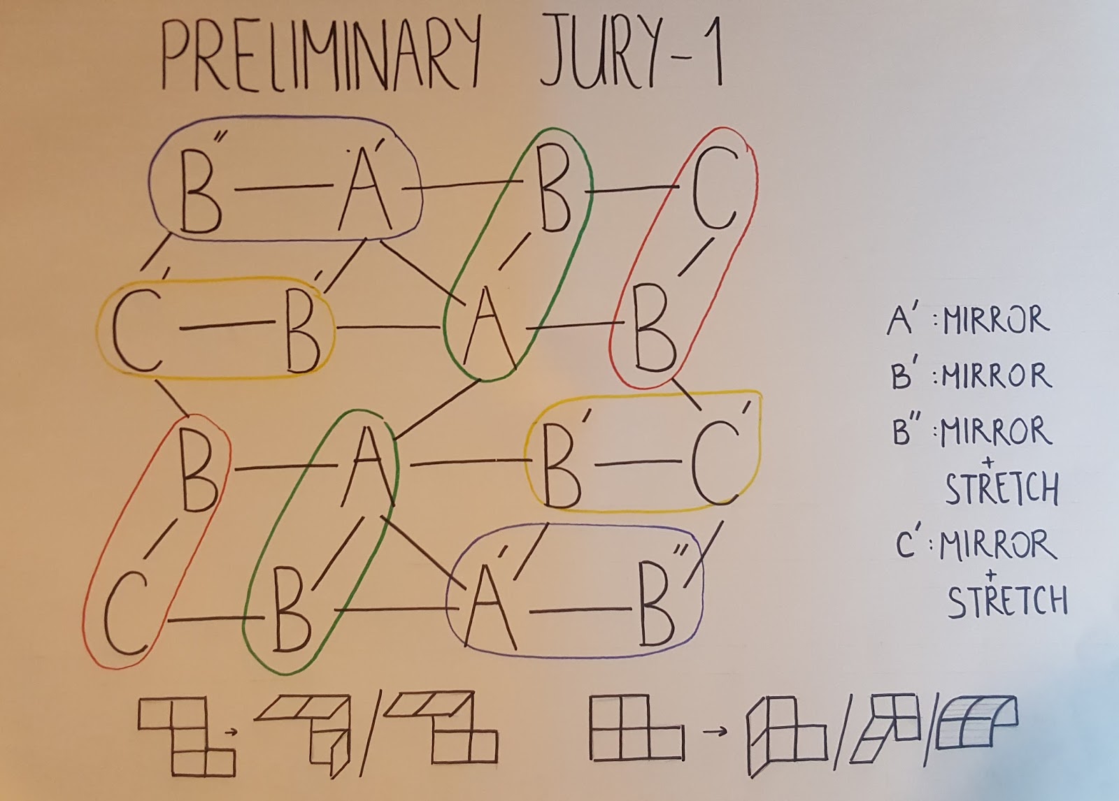
Starting with groups, my design consists of 3 different groups ; A, B and C. 2 B groups are connected to an A group. There are two different connection types for group Bs. The connection which is presented with a line is stronger than the one which is presented with a dash-line.. As you see 2 of group Bs are connected to an A group and make a bigger group, and this bigger group is repeated 4 times. Also, two of group As are connected to each other. All of the group Bs ,which have a stronger connection with group As, are connected to the group Bs of the opposite side. There are 2 C groups. These groups connect two of Bs which have a less strong connection with group As. 


Continuing with the design concepts I tried tı make rhythm and contrast. I made a rhythm by using colors and shapes. As you see there are rectangles which are repeated and rotated. On one side, the rhythm starts with white and goes on like light grey and dark grey; on the other side, it starts with black and goes on like dark grey and light grey. As you see, all colors are used in a seguence. In groups As and Cs I used both white and black, and I used them by interchanging. 
I also want to add that in my groups, the elemnts which helps the flow of void in group itself are in different colors. For example, while the group is light grey, the triangles are dark grey. 


ARCH101 BASIC DESIGN / Exercise 6c


Friday, October 28, 2016

ARCH101 BASIC DESIGN / Exercise 7a


THE DESIGN CONCEPT OF RHYTHM
Rhythm is the repetition or alteration of elements, often with defined intervals between them. A progressive rhythm shows a sequence of forms through a progression of steps. In this example, the curves of lines are changing step by step. Rhythm allows this work to develop an internal consistency that makes it easier to be understood. Once we recognize the pattern in the rhythm, we can understand the whole easily. Rhythm is like pattern, in that same elements are repeated; however, in this example with rhythm there are slight variations in the pattern. These variations are the curves that I mentioned before. Also, there is a rhythm in the intervals between the lines. From left to the center, the intervals become smaller ,and in the middle two of them intersect. This is the same again from right to the center. The concept of rhythm ,in this work, provides the easy movement of eyes following the arrangement of lines. For example, when I look at this work, I start following the lines and their progression easily. In the left side of the work, the curves become sharper when the lines become nearer to the center. This is also true from right to the center. Our eyes look at these lines one by one and find a way for where to look next.
ÇAĞLA DUYGU ÜSTÜN


Sunday, October 23, 2016

ARCH101 BASIC DESIGN / Exercise 5c


I have three groups which are located around one group. These groups are same in shape, but they are different in size. One of these groups is bigger than other two. This makes a dominance in my model. There is also contrast between other two groups. In one of them, I used small rectangles and big triangles; however, in other group I used bigger rectangles and smaller triangles.

(Each of my groups has 3 same subgroups which consist of 1 square, 2 rectangles and 2 triangles.)


ÇAĞLA DUYGU ÜSTÜN

ARCH101 BASIC DESIGN / Exercise 5b


ARCH101 BASIC DESIGN / Exercise 3


Starting with my groups, I have three groups which are connected to each other with another group.


Because three of my groups are rotated around a group, which has no symmetry in itself, my model hasn't a symmetrical order.


The group which connects other three same groups consists of two sguares and two triangles. Two sguares, which are connected to one triangle for each, are also connected with each other.


ÇAĞLA DUYGU ÜSTÜN

ARCH101 BASIC DESIGN / Exercise 4


Starting with my groups, I have 4 groups which are located around a central group. 3 of these groups are same with each other, but the other one is a part from the identical groups.


Because the same groups are rotated around the central group, there isn't symmetry. 


As you see, here, there is a group nearer to us, which I used not to make my organization monotonous. As I said at the beginning, this group is the center part of other three identical groups.

ÇAĞLA DUYGU ÜSTÜN


ARCH101 BASIC DESIGN / Exercise 6a


THE DESIGN CONCEPT OF HIERARCHY
Hierarchy exists when an element appears more important in comparison to other things. An element appears more hierarchical if it is larger than other elements. An element can also appear more hierarchical if it is different than other elements. Placement is also important to establish an hierarchical order. In this work of art there is a hierarchical order. The most important element is located in the center of the painting. The artist wants to emphasize the person sitting on a throne in the middle of the scene. The artist drew her bigger than other people and painted her dress in black to make her grab our attention. As you see, the other people in the scene are almost in the same size, which makes the woman in black is the only power. Hierarchy is a way of grabbing attention and guide people where to look at. In this example, except the woman in black, there are two size of people. Some of them are in the front side of the painting, and others are at the back. This makes us look at the people who are nearer  to us secondly, and the people at the back thirdly. Actually, this is the order of importance. 
ÇAĞLA DUYGU ÜSTÜN

Wednesday, October 19, 2016

ARCH101 BASIC DESIGN / Exercise 5a


THE DESIGN CONCEPT OF DOMINANCE
Dominance is a design property that puts emphasis on some points by making them exhibit some control over the other elements. The more dominant element attracts the eye and get noticed first. It is likely to have greater visual weight than the elements it dominates. Dominance can be created through contrast, emphasis and relative visual weight. Identical items can’t dominate each other. To exert dominance, an element has to look different from the other elements. This painting can be an example of dominance. There are three ballerinas, and as you see two of them identical to each other while one of them is different from others. The dominant one is bigger than others; in other words, it has the greatest visual weight. The dominant element is the entry point into a work. It should be the first place you want people to look at. In this example, when I look at it, the first thing which grabs my attention is the ballerina which is bigger and wearing a darker dress. The placement of a dominant element is also important. In this example, the part of the painting we look at is the side of the dominant ballerina. We concentrate mostly to that part. Another thing that makes the ballerina dominant is her dress. The dresses of two identical ballerinas are the same and have a similar shade with the background. Thus, they don’t grab our attention enough. As you see, darker dress or one different thing can be noticed more. The artist puts greater emphasis on that part, so we tend to think that the dominant ballerina is more important than the others.
ÇAĞLA DUYGU ÜSTÜN

ARCH101 BASIC DESIGN / Exercise 5a


THE DESIGN CONCEPT OF CONTRAST
Contrast is a design property that defines elements by making them look different from other elements. Using contrast is a way of emphasizing the point where you want people to look at. The maximum contrast in a work of art is usually located at the center of interest. Artists employ different design features in creating contrast. As an example of contrast we can show this work of art called “Starry Night”. In this work, the artist made contrast in color, size, shape and texture. Starting with color, Van Gogh grabs our attention to the moon and the stars, which poses a contrast to the whole town, mountains and the sky. Another aspect of contrast is size. In general, larger objects are more noticable than smaller ones. In this painting, because the moon is larger than the houses in the town and lots of other elements, it grabs our attention easily. Shape is also creates emphasis by contrast. The moon in this painting grabs our attention by being a very round object while the roofs are angular. There are also stars which are round in the sky. It is because they may be as important as the moon in the scene. The last thing I want to mention is texture. The moon is the relatively smooth object. The other elements in the scene have  a stripy look. It draws our attention away from all of the highly textured elements. By making the moon as the center of contrast, the artist makes us think that the most important thing in the scene is the moon.

ÇAĞLA DUYGU ÜSTÜN